
Graphics images. Salvation to the little ones

Graph of vocation, patiently marking the rails and counting the routes in the art tree trunk. Through his existential symbolism, his works are subtle ironic, the ability to appreciate the present not only rationally and critically, but not only romantic. The artist speaks in a flexible, naive postmodern language again and again, reminiscent of the importance of content, which in Lithuanian graphs is currently in dire need of.
E. Mikalauskis’ drawer is fed by the fruit of his time … What are those fruits? Things, people, self -ports and a lot of voids are much larger than it in the sheet …
With graphic artist E. Mikalauskis since 2005 We worked on the Now Art Now Future, a graphic art biennial together with colleague Jūratė Rekevičiūtė. We developed the social nature of graphics or revised modernism.
Experiment. Inspiration. Exhalation.
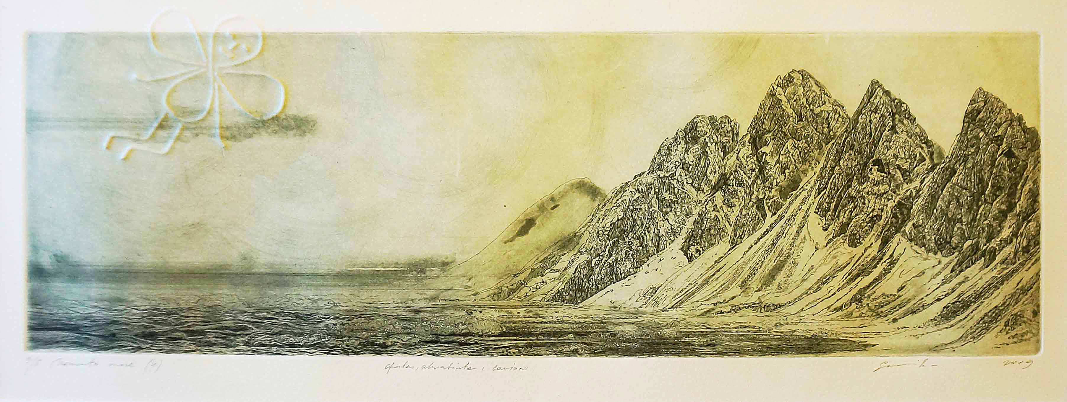
A decade ago, the artist experimented with photography and painting, transferring their benefits to graphics format. In this case, only the concept of graphics changes, where traditional graphics still remain. One of the most clearly distinguished attempts is the author’s work in 2005. In the graphics project « Now Art Now Future. Print » and 2006 At Now Art Now Future. Freedom.
In the latter, the artist moved their dreams with a workshop with the Panevezys Women’s Correctional Facility during the convicts. In the cycle « Horse » (jargon in prison – a man who brings and carried prohibited objects from the zone) E. Mikalauskis in his filmed fragments of his body imprinted the etching fantasies created by the convicts. 2005 He « moved » the reality.
In a picture created by other graphics techniques, he tried to « remove » himself through the back (« Unbearable Reality ») in a picture created by other graphics techniques. These are the unexpected movements – from the real position to the imaginary – give the idea not only to the status of the visual metaphor, but also recharge the already -closed traditional print. Recharges social issues, art synthesis, contextual observations. The appearance of an unexpected object in an unexpected environment is intriguing here, because you do not expect a calm, neat drawing author of such irony and sweet grotesque studs. Such a kind of romantic rebellion.
The author polemizes with cultural use syndrome – shekit’s stereotypes, a snobbish being and a different emphasis on himself. Is that why E. Mikalauskis’ characters are so small? Is that why « inspiration » is equivalent to « exhalation »? This is where the « creative field of being creative » is born.
Upstream.
That life
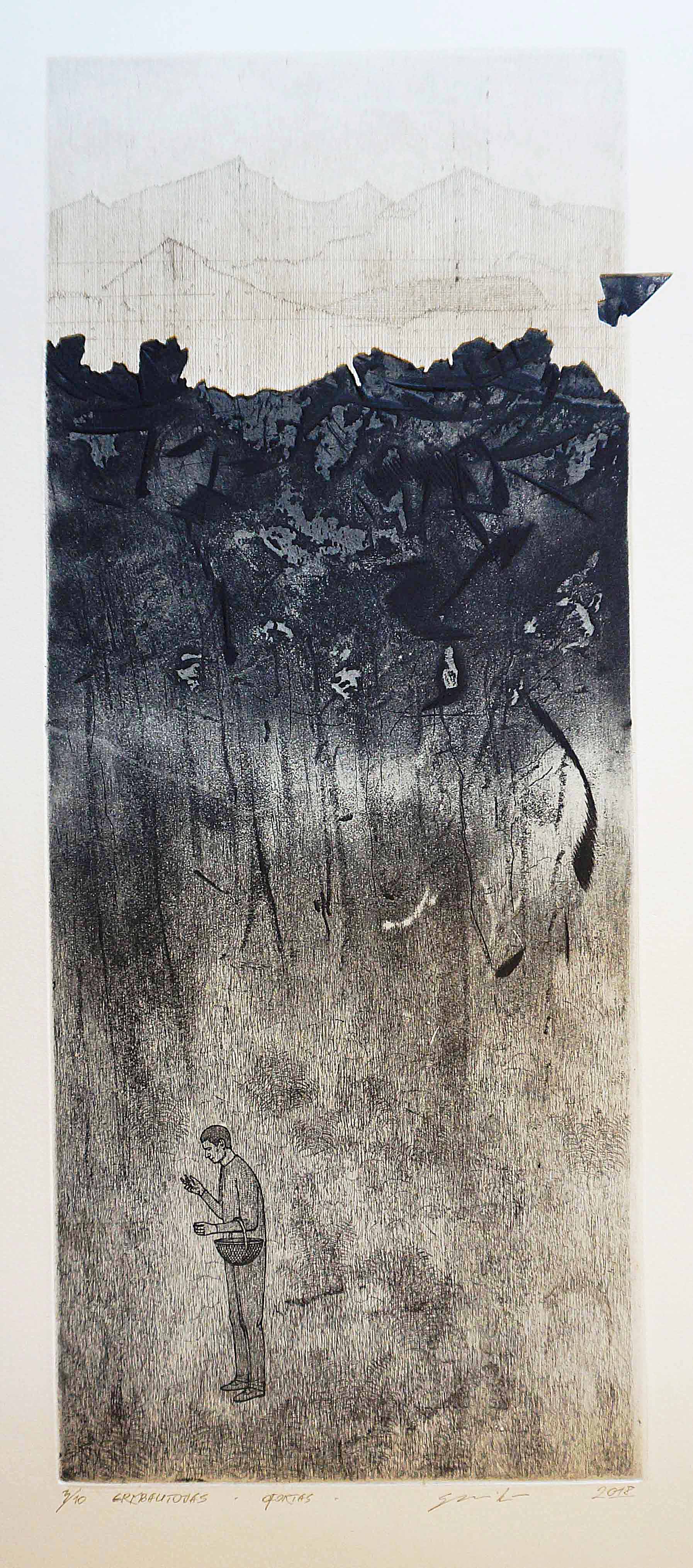
The boundaries of the perception and the activities of the characters in the paintings of E. Mikalauskis are as if pressed between physiological naturalism, between material tangible and elementary life paradox (cats rolling). The paintings do not have a special hierarchy of elements – what is more important: line, stain or point, object or man, or that cat, or Hollywood character, or lingerie? Yes, there is a certain order of layout, or at least its logic, but we will notice things when we are convinced where we have to be, because we have seen it many times in our lives. Both natural, synthetic, confusing, and too straight those labyrinths of thought in a graphically embossed corner of that life …
Only motifs are repeated: household items, buildings, roofs and composition principles (frontalite). However, objects are of particular importance. Like the revitalized still lifes from personified objects that do not lose their shadow. Like the small centrifugal worlds where our stories are born. The worlds tend to put us in ourselves. Such is probably the effect of surrealism. Corners of context, stylistics, art branches, and images of the contexts, and the corners of the modernist but non -classical, graphics somewhere between the spine and postmodern graphics of the realism.
It is time to scream in today’s graphics. It is time to talk about the time to talk about concepts in graphic art.
How many kilometers have you driven?
How many kilometers did you go (named one of the most interesting works of the artist) in search of the roots of graphics? E. Mikalauskis is probably the most Lithuanian graphic artist. Let’s compare: Kęstutis Grigaliūnas « consumer » Lithuanian -value sense stereotypes (Jonas Mekas, Jurgis Mačiūnas and Mikalojus Konstantinas Čiurlionis) and conveys the great naivety that radiated mythologized works of the aforementioned artists and glowed by K. Grigaliūnas context.
E. Mikalauskis himself creates his characters, creating them not myths, but replies into possible mythology. These make it possible to feel better of complexes and existing stereotypes than their visualization.
E. Mikalauskis is one of the few graphs of Lithuania who makes discoveries and decisions not only in the form. And maybe that too long presence in the expressionist environment, determined by modernism, has been so strongly influenced by Lithuanian art that every experiment that takes place in fine art is primarily perceived as form art. Of course, the shape is more tangible, but in today’s graphics it is time to scream. It is time to talk about the time to talk about concepts in graphic art. About what graphics could be. Classical graphics techniques have been performed but speak the language of contemporary art. And about whether the ability to « make a picture » in the future will not pose a danger to the artist’s hearing?
Memento More.
E. Mikalauskis is a schedule that speaks the language of contemporary art. How many of them have we still had? Let’s look at the last few decades. A. a. V. Kalinauskas, Petras Repšys, K. Grigaliūnas, Kęstutis Vasiliūnas, Eglė Kuckaitė, J. Rekevičiūtė, Eglė Vertelkaitė, Lida Dubauskienė. Egmont Beseskas and Asta Rakauskaitė flashed at one time. Other areas of art should be mentioned but not identifying themselves with this area – Eimantas Ludavičius.
The work of E. Mikalauskis is not like the human being of human being, which is popular with the Lithuanian nation. The works performed by etching and mixed techniques – mocking, playful, ironic and revealing aspects of banal life, are paused. The witty but full of seriousness, the world and the person who is in it talks about the choice of one of the most interesting graphs in Lithuania is to follow the path of conceptual graphics.
Curatorship is reborn
Our meeting with Evald 2020 In Klaipeda, when we tried to justify the NOW Art NOW Future work, and in 2024. The graphic biennial became a symbolic moment of art and science in Kaunas. “The Fourth Kaunas International Biennial of Graphics – About the Nature of Light and Science” turned out to be more than just an artistic exposition. The artists participating in the exhibition conveyed the modern art language that spoke about the daily life of the print.
Then I stated that there is a growing tendency to unite art and science lately, reflecting the environment through art research and presenting it to the audience. In scientifically, graphics are a chemical-physical process where each dash becomes a guarantee of authenticity. Technology invasions should not be feared into this sensitive area of art – on the contrary, it opens up new opportunities and allows you to interpret classic forms in a modern perspective.
Mushroom.
Our discussion about the future of art has naturally joined the theme of the Biennale – how art can become not only visual but also conceptual as it reflects scientific achievements and fragments of everyday life. The works presented at the Biennale acted as dialogues of the open platform – between tradition and innovation, between the viewer and the creator, between scientific analysis and artistic interpretation. Unfortunately, the beautiful tradition of the rebirth of the graphic biennial in Kaunas ends. Fatigue, organizational work, logistics are for many people. However, the permanent working group does not create.
Evaldas’ work is an attempt to reconcile two contradictory poles of one culture – man and his clone. Himself as a pseudo -bump, a sign of the pseudo -apylin, which no longer needs this environment.
Happy time
Through the existential symbolism, the artist’s metaphoricality of the artist, the subtle grumpy is the ability to appreciate the present not only rationally and critically, but not only in romantic past. The artist speaks in a flexible, universal postmodern language that reminds the importance of the content of the work.
After all, the proportions of the beauty are brought to become even more expressive to discuss, argue, claim a mature schedule – a culture that has become a picture. The drawing of the fruit of its time, but not losing self -esteem, is like a breastfeeding finger of God.
Evald’s work is an attempt to reconcile two contradictory poles of one culture: man and his clone. Himself as a pseudo -bump, a sign of the pseudo -apylin, which no longer needs this environment. Status character posture is opposed to lyrics, with a Lithuanian stroke.
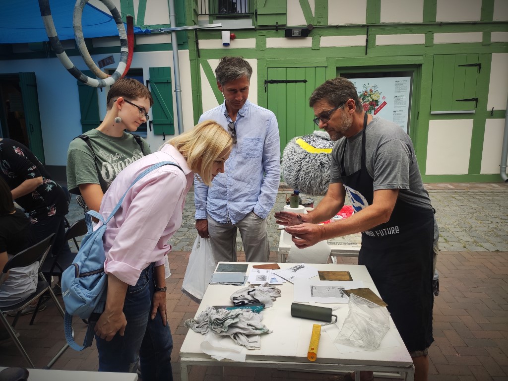
Connection: In the creative graphics workshop « New Art. Revival » with E. Mikalauskis, 2020. / Photo by A. Tumšienė
Therefore, it is not worthwhile to be surprised when you find the identities of the human and the image, the image of the image, and it is not worthwhile to be wondering, like a silhouette that bounces from the background perspective. The first impression of this image is the naturalness of its construction. This is how we are in the third – philosophical – layer, but these layers are easy to read and use. Like the author enjoying the advantages of photography, the opportunity to realize the idea faster than the painting.
Social issues, art synthesis or analysis, contextual games – there is nothing suspicious, except for an unexpected appearance of an object in an unexpected environment. The author ironizes cultural use syndrome: behold, the stereotypes, the snobbish being and the attitude towards ourselves are inserted.
In both the events of our existence and the desire and aggressiveness of life, the « creative, bodily forced field of sexuality » is born. The distance between reflection and corporeal naturalism, physical tangibleness becomes penetration into the archetypality of its nature by massaging the skeleton of corporeality.
All you have to do is get involved in the fun of the « Crossing Hierarchy ». So, in vain, not spending time, 2008 We printed the first graphic review by turning it into a language of the stamp – print, « Art » in the magazine 100 units. pristration. It’s a trick, but it resembles a lively graphic time!


